Good research to check the range and also the signs which are know for not having the best clarity.
Thursday, 13 October 2011
Research from butchers row in Leeds market
Good research to check the range and also the signs which are know for not having the best clarity.
Wednesday, 12 October 2011
Butchers vs Supermarket
As a farmers daughter I would be very, very wary of supermarket meat and personally never buy it. A local butcher can tell you (and some display) exactly where their meat come from, which cattle market, which dealer and sometimes which farmer. I'd rather pay the extra (although very often the butcher is cheaper anyway) and know that my meat is traceable than risk Tesco or some other supermarket packaging which at best states "British Beef" or sometimes only actually states "packed in the UK" The way I see it good butchers are specialists in their field, not jack of all trades
Most butchers seem to be closed in the evening when I do my weekly food shop. I'm at work all day so normally shop mid week evenings and there is no way I would want to go shopping at the weekends!
- Better range of meats - for example our local does mutton, bilton, boerwors (both south african specialties - first dried meat sticks, second v. good sausages), good range of game (venison, rabbit, small game birds.....
- Great quality
- Good prices - and our butcher does have price tags - and often bargains too (for example we got a 3 1/2 kg pork neck joint for £8 this weekend!!!!)
- They're willing to do bones for our dog for free or very small surcharge (a pound or less)
I usually use the butcher, the meat tastes better and it keeps the local economy going. Also get a few freebies and sample now and again, you wouldn't get that service from a supermarket. My butcher also specially made some black pudding & bacon sausages for us
Personally i prefer butchers meat, tends to be of a better quality, I usually find this comes into play when buying steaks, steak chunks or side of beef. For meats such as mince find theres not a huge difference. Also have to say butchers sausages much much better too.
I use the butcher when I can. The quality is so much higher but I definitely don't save any money, they probably cost a bit more.
Do you shop at your local butcher? If so, do you save any money by doing so? Is the quality of the meat really any better? If not, why do you shop at a supermarket rather than a butcher?
I went to a local butcher today to get meat. Maybe I went in with unrealistic expectations of how much things cost, but I came out spending the same on meat as I would Tesco. The only difference is that Tesco (where I do my grocery shopping anyway) and the butcher are in opposite directions. To me, if I'm going to spend £2.80 (give or take 10p) on one pound of steak mince, I might as well get it in the same place as I would get the rest of my bi-weekly shop, rather than going to two or three different shops to get everything. The thing I didn't like was that nothing had a price on it. At least when I go to Tesco, I know how much I'm paying up front rather than wondering if the guy is just charging whatever comes to mind at that moment.
I went to a local butcher today to get meat. Maybe I went in with unrealistic expectations of how much things cost, but I came out spending the same on meat as I would Tesco. The only difference is that Tesco (where I do my grocery shopping anyway) and the butcher are in opposite directions. To me, if I'm going to spend £2.80 (give or take 10p) on one pound of steak mince, I might as well get it in the same place as I would get the rest of my bi-weekly shop, rather than going to two or three different shops to get everything. The thing I didn't like was that nothing had a price on it. At least when I go to Tesco, I know how much I'm paying up front rather than wondering if the guy is just charging whatever comes to mind at that moment.
Tuesday, 11 October 2011
Brazil Type Research


Pixação, known also as "wall writings," began in the 1940s and 50s as political statements written in tar and “were often written in response to the slogans painted by political parties across the streets.” [2]. “Piche” is the Portuguese word for tar, so Pixação refers to writings made in it. In the 1970s, Pixação almost disappeared, however it was revived in the 1980s by a group of kids who began writing their names, and the names of their crews, The letters are usually of equal height and spacing, although technique varies in different cities around Brazil.Although the lettering originally reflected the typography of eighties heavy metal record covers, the styles have evolved over time
Os Gêmeos (Portuguese for The Twins) are graffiti artist identical twin brothers (born 1974) from São Paulo, Brazil, whose real names are Otavio and Gustavo Pandolfo. They started painting graffiti in 1987 and gradually became a main influence in the local scene, helping to define Brazil's own style. Their work often features yellow-skinned characters - taken from the yellow tinge both of the twins have in their dreams - but is otherwise diverse and ranges from tags to complicated murals. Subjects range from family portraits to commentary on São Paulo's social and political circumstances, as well as Brazilian folklore. Their graffiti style was influenced by both traditional hip hop style and the Brazilianpixação movement.[1]


Os Gêmeos (Portuguese for The Twins) are graffiti artist identical twin brothers (born 1974) from São Paulo, Brazil, whose real names are Otavio and Gustavo Pandolfo. They started painting graffiti in 1987 and gradually became a main influence in the local scene, helping to define Brazil's own style. Their work often features yellow-skinned characters - taken from the yellow tinge both of the twins have in their dreams - but is otherwise diverse and ranges from tags to complicated murals. Subjects range from family portraits to commentary on São Paulo's social and political circumstances, as well as Brazilian folklore. Their graffiti style was influenced by both traditional hip hop style and the Brazilianpixação movement.[1]
Australia research for type
The Sydney Opera House is considered one of the finest architectural achievements of the 20thcentury. It is also one of the most recognizable buildings on the planet. Even those who don't actually know that it is located in Australia or that it is an opera house are familiar with its rising segmented shape. The conventional wisdom surrounding the Sydney Opera House is that its gleaming white circular spires is supposed to represent the sails on the tall sailing ships that brought so many of the ancestors of the Anglo residents of modern day Australian to the island that would pay penance for their treatment of the indigenous tribes by being forced to admit they were also responsible for Jacko, Yahoo Serious and makingMel Gibson a star. In fact, the design of the Sydney Opera House is not based upon sails of wooden ships.


Construction of the Sydney Opera House was initiated in the 1950s by Eugene Goossens, who was the conductor of the Sydney Symphony Orchestra. A competition to arrive at a final design commenced thereafter and the winner was a Danish gentlemen named Jorn Utzon. In light of the work of Frank Gehry and all the other fantastical designs that place themselves in opposition to the standard square and rectangular means of constructing buildings today, Utzon's concept probably came as quite a shock to those intent on building the opera house. Rather than straight and narrow or broad and flat, Utzon proposed the radical idea of huge shell-shaped structures exuding outward from the center of the building. Utzon's opera house design was even more bizarre than some of the circular buildings that were the epitome of edgy at the time. The site for the new Sydney Opera House was to be located on the water and so it perhaps seems just natural accept that the design was intended to represent sails on a ship.
As with many things that seem obvious, however, it is simply not true that the elegant design of the Sydney Opera House as anything to with the conventional wisdom. The inspiration for those segmented curvatures atop the most famous building in the Southern Hemisphere was not the sails of a ship, but rather a simple orange. The Sydney Opera House is supposed to look like the segments of a orange that has been carefully sliced open. Regardless of whether the Sydney Opera House reminds you of orange slices or sails atop a ship, it has gone on to become a modern architectural wonder despite the fact that history's most famous architect, and the real life inspiration for Ayn Rand's ridiculously simplistic hero Howard Roarke, said of it: "The circus tent is not architecture."


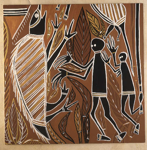


Africa Symbolic Research
 Maybe the process could be lino cut after the typeface is produced.
 Looking at the patterns and shapes to influence the typeface structure. Ie Triangles


Africa Symbolic Research to base a typeface influenced by this.
Subscribe to:
Posts (Atom)