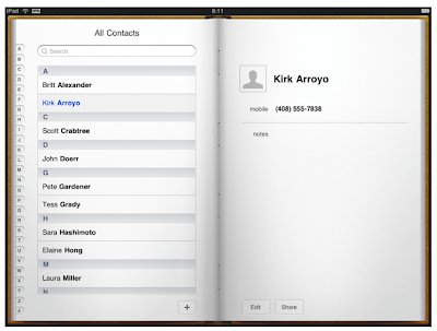
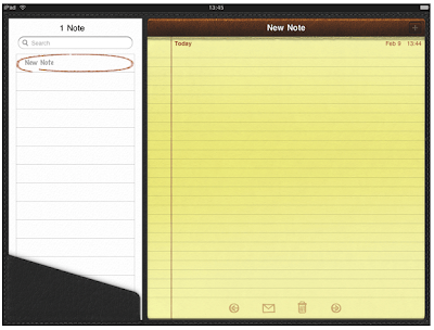
For iPad, think of ways to allow more than one person to use your app on the same device. For example, two people might be able to play a game on opposing sides of an onscreen board. Or a band application might allow different people to play different instruments together on a single device.

On iPhone, people instantly know what the Voice Memos app does, and how to use it, because it presents a beautifully rendered focal image (the microphone) and realistic controls.

Think of the objects and scenes you design as opportunities to communicate with users and to express the essence of your app. Don’t feel that you must strive for scrupulous accuracy. Often, an amplified or enhanced portrayal of something can seem more real, and convey more meaning, than a faithful likeness.
Use appropriate animation to further enhance realism in your application. In general, it’s more important to strive for accuracy in movement than in appearance. This is because people accept artistic license in appearance, but they can feel disoriented when they see movement that appears to defy physical laws. As much as possible, make sure your virtual views and controls mimic the behavior of the physical objects and controls they resemble. Convincing animation heightens people’s impression of your application as a tangible, physical realm in which they want to spend time.

When appropriate, create high-resolution artwork. In most cases, scaling up your artwork is not recommended as a long-term solution. Instead, try creating your artwork in a dimension that is larger than you need, so you can add depth and details before scaling it down. This works especially well when the dimension of the original art file is a multiple of the dimension you need. Then, if you also use an appropriate grid size in your image-editing application, you’ll be able to keep the scaled-down art file crisp and reduce the amount of retouching and sharpening you need to do.
Ensure that your launch images and application icon are high quality. For guidelines on how to create these, see “Custom Icon and Image Creation Guidelines.”
Remove hard-coded values that identify screen dimensions. This is particularly important if you want your app to run on different iOS-based devices.
No comments:
Post a Comment